 Photo by: shutter_o/Shutterstock
Over the last month or so, we’ve all seen a lot of coronavirus charts, such as the Financial Times’ tracking of cases (and now deaths) across multiple countries, the New York Times’ map of the virus in the United States, and the Guardian’s map of the global spread of the virus.
Do we really need yet more coronavirus charts? In this blogpost, I want to go through a few issues on charting coronavirus data – pointing out some pitfalls for the unwary, broadening the coverage out to the developing world, and introducing a new type of chart that captures mortality, cases and case fatality – all in one chart.
But first a couple of hat-tips: to the Johns Hopkins University's (JHU's) Center for Systems Science and Engineering (CSSE) which updates global COVID-19 data on a daily basis, and to Tableau for making the CSSE data easily accessible to researchers. All the charts below were generated using data from this source (updated at close of business on 4/13/2020).
Deaths vs. death rates
The first pitfall for the unwary is that most charts comparing coronavirus deaths across countries (including the FT’s charts) don’t adjust for population size – they show the number of deaths, not the death rate. Actually, to be precise, they show the number of deaths attributed to COVID, which likely understates the true number of COVID deaths, since some people who die from COVID may never get diagnosed with COVID – they may die at home or a home for the elderly and may not get included in the official tally, they may never be tested, or their death may be attributed to another cause. Two recent newspaper articles give a sense of the undercount: The Economist cites a study of Italy’s Bergamo province comparing total deaths in March 2019 and March 2020, finding that less than half the increase in deaths was attributed to COVID-19; and the New York Times reports that the number of deaths occurring in homes or on the street in New York City in the first five days of April 2020 was over eight times the number recorded during the same period in 2019, but it is unclear how many (if any) of these deaths were included in the official COVID tally.
Subject to this caveat, the maps in Figs 1 and 2 show the effects of adjusting for population size. They show deaths and the mortality rates for each country 15 days after the 30th confirmed case in that country. So, the numbers for China are for 2/5/2020 while the numbers for South Africa are for 3/28/2020. The numbers capture each country at roughly the same stage of its COVID-19 epidemic.
In Fig 1 we see large numbers of coronavirus deaths in some the world’s largest countries, including Brazil, China, the Democratic Republic of the Congo (DRC) and the United States. This isn’t altogether surprising, and for some purposes the absolute number of deaths is not the most interesting number. Fig 2 adjusts for population size and presents the death rate or mortality rate per 100,000 population. The picture looks very different. Brazil, the DRC and the United States all go from red to green – while they have recorded a lot of COVID deaths, their death rates are not high by international standards. China’s COVID experience looks less extreme when looking at its death rate rather than its absolute number of deaths. Countries like Iceland, Ireland, Lithuania and Sweden look worse when their small populations are taken into account.
Fig 1 Total deaths 15 days after 30th confirmed case
Fig 2: Mortality rate per 100,000 population 15 days after 30th confirmed case
Natural units vs. logs
The second pitfall for the unwary is the scale used to show deaths. Many charts, including the FT’s charts, use a log scale, the idea being it’s easier on the eye when trends are compared across countries with quite different numbers of deaths. While using a log scale may be easier on the eye, it’s also harder to get a sense of the real differences across countries.
Figs 3 and 4 show the effect of switching to a log scale. Both charts capture Italy’s downturn, but the log scale makes it look less pronounced than it really is. The log scale also masks the extent of the excess deaths in the United States after Day 30 – the gap between Italy and the United States after this point is much more pronounced than the log scale suggests.
Fig 3: Trends in deaths in Italy and the US (arithmetic scale)
Fig 4: Trends in deaths in Italy and the US (log scale)
Trends in developing countries
Most of the focus in COVID-19 charts has been on the experiences of high-income countries – understandably so, given, except for China, that’s where most deaths have been. Fig 5 shows trends in daily deaths for some of the worst-affected developing countries. (The y-axis is in arithmetic numbers, not logs.) China’s rapid ascent and descent are evident. Iran’s ascent is also evident, as is the much longer time it took (compared to China) to bring deaths down. Turkey was on a similar trend to Iran but then apparently managed to stem the increase in deaths more quickly. Brazil’s increase in deaths occurred somewhat later in its epidemic than in these other three countries. India, Indonesia and Mexico have seen fewer deaths, but they are inching upwards. Fig 6 shows the trends in death rates. The picture looks much less gloomy in the large countries – China, India and Indonesia.
Fig 5: Trends in deaths in the worst-affected developing countries
Fig 6: Trends in the death rate in the worst-affected developing countries
Breaking down the mortality rate into cases per capita and the case-fatality rate
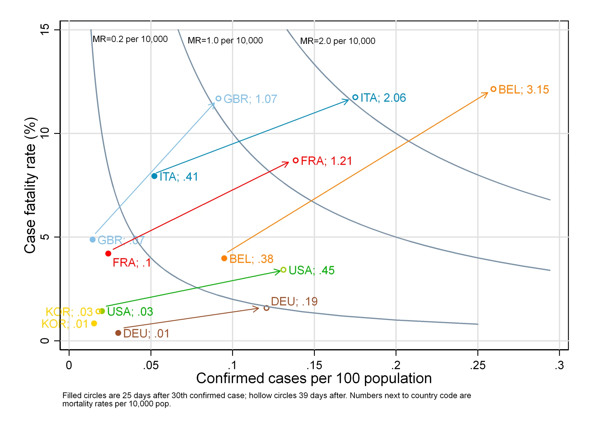
Last – the promised new type of chart. We can think of the mortality rate (deaths divided by population) as the product of two numbers: (a) the number of cases per capita (cases divided by population) and (b) the case-fatality rate (CFR) (deaths divided by cases). The first tells us the fraction of the population that acquires the coronavirus (i.e. becomes a COVID-19 case), while the second tells us the fraction of people acquiring the virus who die from the disease. One country might have a high mortality rate largely because it has a large number of cases per capita, while another may do so largely because it has a high case fatality rate.
Again, a caveat is in order – it’s not just the number of deaths that will likely be understated, but the number of cases as well. This means that (a) – the number of cases per capita – will likely be understated, while (b) – the case-fatality rate – may be under- or overstated, depending on whether deaths are more understated than cases.
Subject to this caveat, we can show the mortality rate, cases per capita and the case fatality rate on one chart like Fig 7. The curves are mortality rate ‘contours’. Just as contours on a map join locations sharing the same height, the contours in Fig 7 join combinations of cases per capita and the case-fatality rate sharing the same mortality rate. Points closer to the bottom-left corner correspond to lower mortality rates; points toward the top-right corner to higher mortality rates.
Belgium and Italy 25 days into their COVID epidemic had a similar COVID mortality rate, but – if the numbers are to be believed – Belgium had a lower case-fatality rate than Italy which was offset in Belgium’s case by a higher number of cases per capita. With the exception of Korea, all countries saw increases between Day 25 and Day 40 in both cases per capita and the case fatality rate – and hence saw increases in their COVID mortality rate as well. Some countries saw sharp jumps in their mortality rate in these 15 days. Belgium and Italy stand out at as countries with high mortality rates; by contrast, Germany and the US – even after 40 days – have relatively low rates; in Germany’s case, largely because of its low case fatality rate.
Fig 7: Cases, case fatality and mortality 25 and 40 days after 30th confirmed case




Join the Conversation