How has globalisation affected inequality in incomes around the world? How do the incomes of the richest Chinese compare with those of the poorest Americans, and how has the gap changed over the last 20 years? Where do the poorest and richest people in the world live?
To answer these and related questions (see World Bank working paper 6719), Branko Milanovic and I recently compiled a new database of more than 550 household surveys between 1988 and 2008. We combine the World Bank’s PovcalNet data to with evidence on the rich countries, mostly from the Luxembourg Income Study. Every person in the world is assigned the average income of his or her income decile. Incomes are measured in per capita and adjusted for purchasing power parity differences across countries.
With a Gini coefficient of around 70 percent, income inequality at the global level remains high, compared with inequality within countries. Over these 20 years, global inequality declined from around 72 percent. However, given the numerous sources of measurement error in our data set, we cannot be sure that this represents a real decline. Furthermore, in our view, looking below the surface at the movement of individual country-decile groups might reveal more interesting changes.
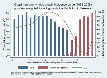
The green line in Figure 1 shows how the 20-year income growth rate between 1988 and 2008 (on the left axis) varies with the position in the 1988 global distribution. The graph shows that those country-deciles which in 1988 were around the global median grew fastest over the next 20 years, their incomes almost doubling. The blue bars (read from the axis on the right) show that almost 90 percent of these people came from Asia. On the other hand, those individuals who were around the 90th global percentile in 1988 experienced the slowest growth in the next 20 years. Almost all of them came from rich countries (the red bars in Figure 1). [The mature economies include the 27 member states of the European Union and the other high-income countries in the world.]
In an earlier blog-post, one of us presented a very similar chart that showed the growth rate in the average income of a particular percentile of the global income distribution (the “anonymous growth incidence curve”). For example, it shows how the incomes of the global middle class have grown over time. However, the global middle class might consist of completely different people in the initial and final years. Figure 1 presented here tracks the same country-decile over time. [Of course, within every country, individuals could have switched deciles, so this analysis is not fully non-anonymous – for an application of non-anonymous growth incidence curves to measuring mobility within countries, see chapters 2 and 4 of this report].
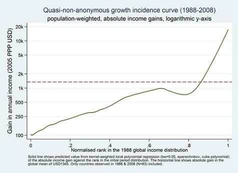
The income gains in Figure 1, which were particularly large for those country-deciles around the global median in 1988, are measured in relative (percentage) terms. Figure 2 shows the same chart, but now the USD-gain (i.e. the gain in absolute terms) is on the vertical axis. In absolute terms, the 80th percentile, which had a relatively low growth rate (Figure 1), performs no worse than the median. Because global income inequality is so high, absolute gains are also very different, which is the reason for showing Figure 2 on a logarithmic axis.
As a result of these differences in income growth rates across the world, the global distribution and its regional composition have undergone profound changes over this twenty-year period. Figure 3 decomposes the global income distribution into China, India, Sub-Saharan Africa, the mature economies, and the rest of the World. We can see a clear right-ward shift of the Chinese distribution, i.e. towards higher incomes. By contrast, an increasing proportion of the poorest people in the world come from Sub-Saharan Africa, which is also confirmed by the evidence on global poverty . The upward movement of China changed the overall shape of the global distribution from a twin-peaked to a single-peaked distribution. The share of the world population living on between $PPP 2 and $PPP 16 per day (i.e. between 730 and 5840 per year) increased from some 23% to 40%.
The World Bank’s goal of boosting shared prosperity (defined as the growth rate of the bottom 40 percent of a country’s population) implies a concern for inequality within countries. At the global level, the most important source of inequality are income differences between countries. Thanks to the strong growth in some parts of Asia, this source of inequality has declined, but it still explains more than 75 percent of global inequality (as measured by the Theil-L index). Therefore, to address global inequality, and in the absence of global redistribution or migration to rich countries, economic growth remains the most promising policy option.

Join the Conversation