Some ten years back, World Bank staff working in the Africa Region came up with the idea of producing simple infrastructure atlases for each African country. As these atlases took shape, it was amazing to see how clearly each country's infrastructure story came into focus. We were struck by how closely national infrastructure networks mirrored physical and economic geography, how much they were shaped by the major supply chains underpinning local economies, and even the extent to which conflict-affected areas suffered from an absence of infrastructure.
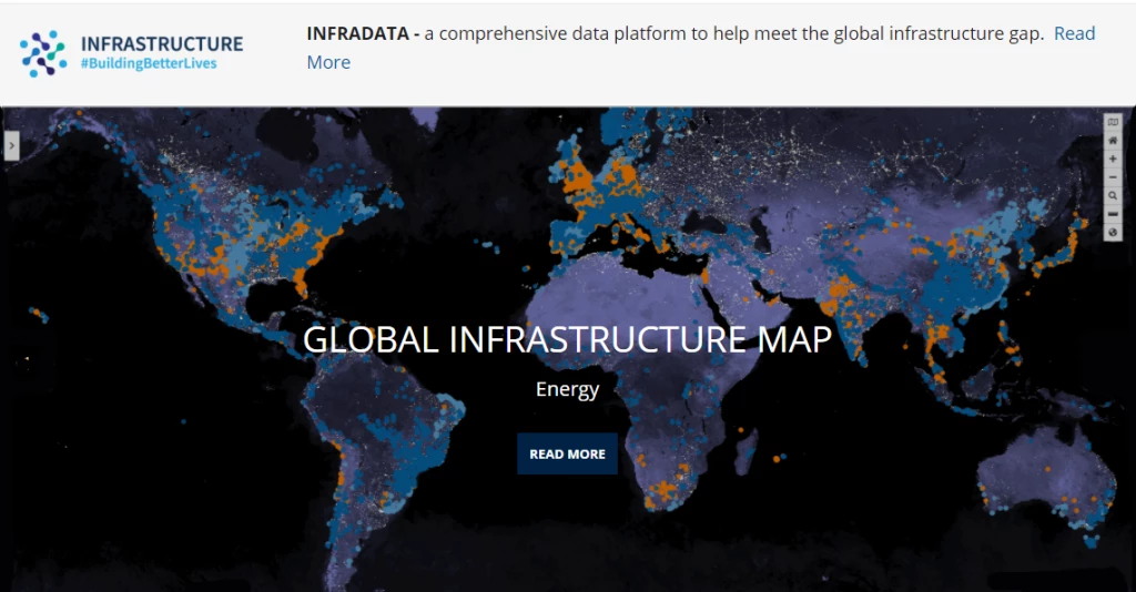
Building on these early experiences, the World Bank has developed a Global Infrastructure Map. The idea of the map is to bring together all available global geospatial data layers relevant to infrastructure in a single user-friendly platform. This has meant a combination of compiling and collating relevant public domain datasets, and selectively acquiring key proprietary datasets.
The resulting map offers some 55 layers of geospatial data at – https://infradata.worldbank.org. (Bank staff, please use the FURL infradata/)
- The map includes many important layers of geographic context, such as topography, climate, population, disaster risk, agricultural activity, and administrative boundaries.
- For digital infrastructure, the only non-proprietary data layers available relate to submarine cables.
- For energy infrastructure, the map displays power plants (by size and technology), as well as grid infrastructure and nightlights
- For transport infrastructure, layers include roads (by category) and rail networks, as well as seaports and airports, and a friction surface portraying the extent of isolation from cities.
- In addition to the networks themselves, the map includes choropleth layers that allow cross-country comparisons on country level economic indicators such as cellular subscriptions, energy intensity, or container port traffic.
- The map also conveys international interactions through lines that visualize a country's imports and exports of different types of energy, and eventually its connectivity links with other countries through air or sea transportation.
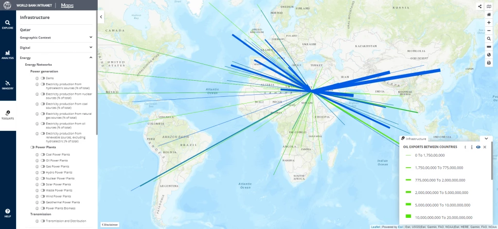
The platform supports different types of uses. The starting point is an interactive visualization, by switching different layers on and off; which can be undertaken at the global level (zooming into specific regions and sub-regions) as well as at the national level. Thereafter, users can convert their selected map into a PDF file for export into documents and presentations. For those wishing to do their own geospatial analysis, the map also provides access to the underlying geospatial datafiles.
The Global Infrastructure Map is a work in progress, and we plan to update annually with additional data layers as these become available. Some notable gaps remain that will pose challenges to fill. For instance, there is no globally available map of countries' fiber optic backbone. Nor do we yet have a global map of navigable waterways, while road quality and traffic flows are only available for some specific countries where surveys have been undertaken.
While this resource was designed to support World Bank analytics, its applications are very much wider in terms of enriching a whole range of operational and analytical needs, as well as providing a conversation starter for client dialogue. When it comes to infrastructure, a picture really can be worth a thousand words.
Please direct any feedback or questions to infradata@worldbank.org.


Join the Conversation